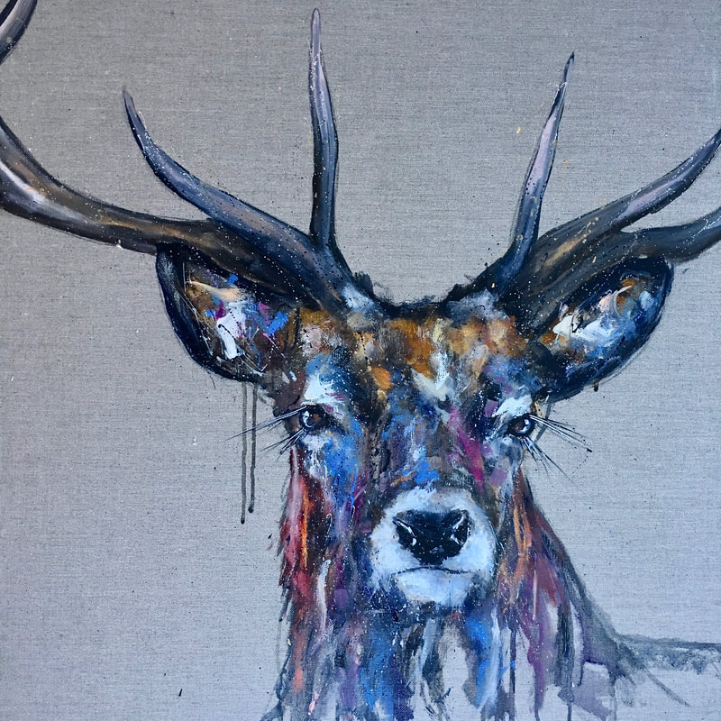
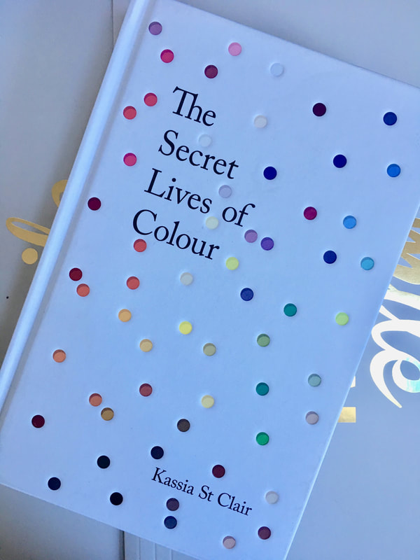
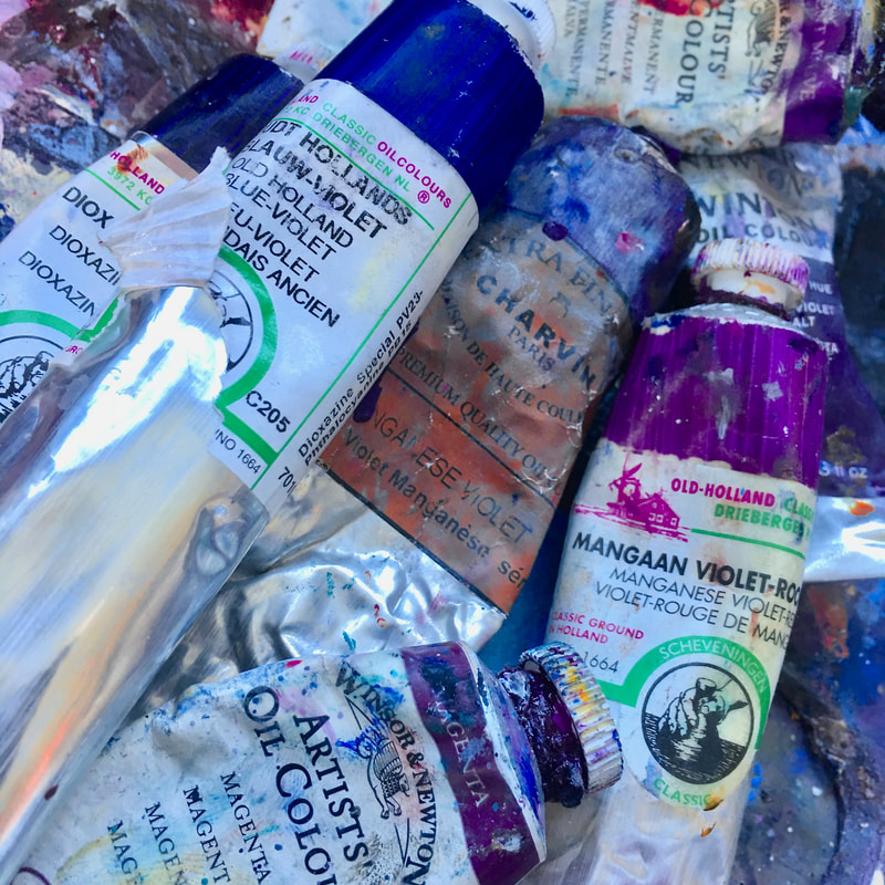
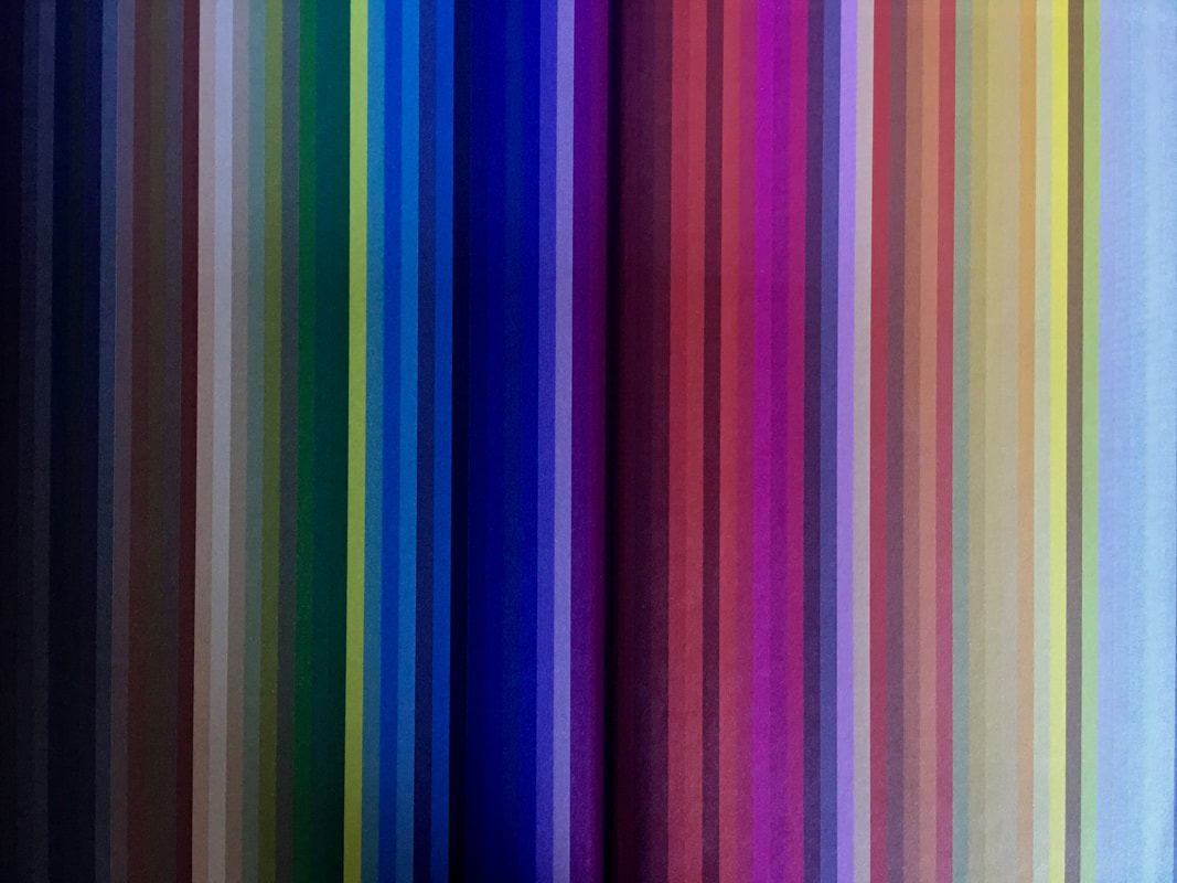
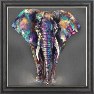
I love seeing colour; what can you see? My head has been spinning recently about colour. I love colour. I love the way colour springs on to my canvas. I love the way that a random bit of blue can completely change swathes of brown. And I’ve always been fascinated by the way I see colour. I share my life with a scientist and it’s always interesting to see where the science ends and the art starts; especially when it comes to colour. Recently I was doing a painting demonstration at a gallery of a Stag and as I reached out to paint some Kings blue, a person watching me said “how do you know to put blue there?” I showed her my reference photo and my sketchbook and said “Well it’s very obvious that the shadows here are blue....And this dark shadow here is clearly deep Violet” She looked at me puzzled. “Really? but all I can say is brown and grey”. It was at that moment that I realised colour is a personal thing. Is it that she wasn’t looking properly or is it that I really see things differently? Even science can’t really explain why we might see colour so differently. We’ve probably got the same number of rods and cones, about 12 million and six million respectively. We’re both evolved which means we can see the violet end of the spectrum, something that Neolithic man could not have done, barely only having the primary colours at that stage in our evolution. So what was going on? What was I seeing that she couldn't see? One simple answer could be personal bias. I adore purple and purply shades of blue. I often include purple that other people don’t see, particularly in my animals who are often brown and grey. So is it just my bias to whip out the magenta and the deep Violet shades from my paintbox or is there something else going on here? I’ve started reading a book called “The secret life of colour” by Kassia Saint Clair and it’s fascinating. Almost like a dictionary of the story behind every colour. I instantly sped myself right into the heart of the book where the chapter on Violet is. I started to discover that I’m in very good company with my use of blue and purple. In Paris in 1874 a group of artists found the anonymous Society of painters sculptors and printmakers. I’m in jolly good company because that group included names such as Edgar Degas Claude Monet, Paul Cezanne, Camille Pissaro to name but a few. They were highly criticised by the salon and by the noted newspaper Le Charivari for their preoccupation with the colour Violet. Some theories of been presented as to why. One appears to be the concept of spending so much time outside. These French impressionist were framed for their en plein air painting. And having worked so hard outside painting sunny yellows when returning to the studio your eyes see the negative and start to see purple. I have definitely known the phenomenon of working outside and returned to the studio where it suddenly seemed very dark indeed, but I don’t think this can possibly be the reason for the purple. Firstly I tend not to see purple, instead a weird deep green and secondly it doesn’t take very long for my eyes to adjust. A later theory suggested that the impressionists conviction that shadows were never really black or grey but were coloured, started to evolve. As I write this, I look around my studio at my paintings that are drying and I see that that is exactly what I’m doing. A light grey shadow nearly always is painted in some kind of blue. And a deep dark shadow is painted in deepest purple (sometimes mixed with Siena to really make it very dark indeed).
So do I really see colour where there isn’t any? Or do I exaggerate a hint of colour when I find it? I’m not sure. One thing I do know is that I will continue to use my blues and purples, I love my use of colour and it is the most commented on aspect of my work. Next week I’m heading back to where that secret society of artists began; Paris. Where I will be visiting a beautiful art shop and will return with surprising colours. So my very British animals, in the coming months, will definitely have a French impressionist feature to them. I very much look forward to sharing those with you.
0 Comments
Leave a Reply. |
Louise LutonArtist Categories
All
This section will not be visible in live published website. Below are your current settings: Current Number Of Columns are = 3 Expand Posts Area = 1 Gap/Space Between Posts = 10px Blog Post Style = card Use of custom card colors instead of default colors = Blog Post Card Background Color = current color Blog Post Card Shadow Color = current color Blog Post Card Border Color = current color Publish the website and visit your blog page to see the results Archives
July 2019
|